Why Visual Hierarchy Matters in Service Websites
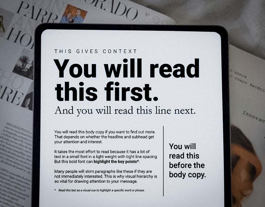
Most websites fail for one simple reason: people do not know what to look at. The layout is confusing. The message is buried. The calls to action are hard to find. And when that happens, visitors do not stay long enough to become clients.
This is not just about making the site more visually appealing. It is about structure. Because when people do not see the right message in the right place, they do not convert.
If you are a service business, your website is not a brochure, it is part of your sales process. And visual hierarchy is what makes it work.
Your Website Has One Job: Guide the Visitor
When someone lands on your website, they are not reading every word. They are scanning.
Your layout needs to help them find answers fast:
What do you do?
Who is it for?
What should they do next?
If your layout does not make that path obvious, they leave. You lose the lead.
This is not about adding more content. It is about creating a layout that earns attention, builds trust, and moves someone toward a decision.
What Visual Hierarchy Really Does
Visual hierarchy is the structure that helps people process what they see. It decides:
What they notice first
What they ignore
What they remember
Whether they click, call, or bounce
This structure tells the visitor what is important and what to do next. Without it, even good content gets overlooked.
If your goal is to increase conversions, leads, or booked discovery calls, then hierarchy is not optional. It is what turns traffic into results.
The 5 Building Blocks of Hierarchy That Work
You don’t need flashy animating features; what you really need is a clear framework that enhances the buyer's journey and leads them to success.
1. Font Size: Make your headline the biggest thing on the page. It should grab attention right away.
2. Font Weight: Only use bold for the important stuff. If everything is bold, nothing stands out.
3. Spacing: Don’t write long blocks of text. Use space to break things up and make it easier to read.
4. Contrast: Make sure your buttons and links stand out. Use clear colors to show where people should click.
5. Placement: Put the most important info at the top. Don’t hide your main message in long paragraphs.
A Real-World Fix: Same Copy. Better Layout. More Inquiries.
A business consulting firm launched their site with clear messaging and a strong offer. But it was not generating inquiries.
The content was thoughtful. The services were clear. So why was no one reaching out?
The headline was too small
The layout felt dense
The call to action was too far down
We did not rewrite the message. We reorganized the structure. We used stronger headlines, clearer spacing, and repositioned the call to action near the top. In just a few weeks, inquiries increased. Same offer. Same copy. New results.
5 Signs Your Site Has a Hierarchy Problem
You do not need fancy metrics to know something is off.
Watch for these clues:
You get visitors, but no one schedules a call
People visit your site but don’t act
Clients ask basic questions that should be answered on your site
You find yourself saying the same thing over and over on calls
Your website feels cluttered, messy, or confusing
When this happens, the issue isn’t your offer; it’s how your website shows it. Keep it clear, keep it simple, and you'll see the difference.
Clean Design Does Not Equal Clear Strategy
A lot of service providers aim for “minimal” design. But minimal is only effective when the structure does the work. A clean layout without hierarchy just makes your message easier to miss.
The right structure should:
Show the value of your service
Reflect your level of professionalism
Make the next step obvious
That is how websites build trust and support business growth. Not with more design. With more clarity.
Your Website Should Help You Close Sales
Your website is a sales tool. If it is not getting inquiries or helping you qualify leads, it is not doing its job.
Ask yourself:
Does the headline grab attention right away?
Can someone understand your offer in five seconds?
Is the next step (like booking or calling) clear and visible?
If you are guessing, your visitors are guessing too. And that costs you leads.
You Do Not Need More Content. You Need the Right Structure.
At Boston Graphic Design Studio, we help service-based businesses build clear, strategic websites that guide the right people toward action.
We focus on structure, layout, and visual hierarchy and visual aesthetics, so your site earns trust, supports your sales process, and works for you.
If your website looks fine but is not performing, it is time to fix the structure.
Useful Resources:
If you want to learn about visual hierarchy, check out this useful resource:
🔗 A Comprehensive Guide to Using Visual Hierarchy in Website Design
It explains how layout, color, and structure impact user behavior and can boost conversions.

Frequently Asked Questions About Visual Hierarchy in Website Design
What is visual hierarchy in website design?
Visual hierarchy in website design is how a page guides visitors to what matters most. It uses layout, font size, spacing, and placement to show people where to look first, second, and next. For service based websites, strong visual hierarchy helps visitors quickly understand what you do and whether you are the right fit.
Why is visual hierarchy important for conversions?
Visual hierarchy removes decision fatigue. When visitors can immediately see your core message, services, and next step, they feel more confident taking action. Clear hierarchy supports higher website conversions by reducing confusion and making your offer easier to understand.
Why is my website getting traffic but no leads?
This usually points to a layout and structure issue, not a traffic problem. If your website feels busy, scattered, or unclear, visitors do not know where to focus. Weak visual hierarchy causes people to hesitate, lose trust, and leave without contacting you.
How does visual hierarchy help service businesses get more clients?
Service business websites rely on trust. Visual hierarchy helps guide visitors through your value, your services, and your call to action without forcing them to work for the information. When your site flows logically, people are more likely to reach out or book a call.
What are best practices for visual hierarchy on a service based website?
Strong visual hierarchy usually includes:
One clear headline that explains what you do
Subheadings that break content into scannable sections
Clear buttons that stand out and are easy to find
Key information placed near the top of the page
Intentional spacing that guides the reading flow
These elements work together to lead visitors forward instead of overwhelming them.
How do I know if my website structure is hurting conversions?
If you find yourself repeating the same explanations on calls or hearing things like “I could not find that on your site,” your website structure is likely unclear. A well structured website should answer common questions before someone ever reaches out.
Does improving visual hierarchy actually increase website ROI?
Yes. Improving visual hierarchy is one of the highest impact website design changes you can make. Small layout adjustments often lead to higher engagement, better lead quality, and shorter sales cycles without rewriting all your content.
What are common visual hierarchy mistakes on service business websites?
Common issues include:
Everything styled at the same size and weight
Long blocks of text with little spacing
Calls to action placed too far down the page
No clear next step for visitors
Too many visuals competing for attention
These mistakes dilute your message and weaken trust.
How does website structure and hierarchy build trust?
A clear, organized website signals professionalism and care. Visitors subconsciously associate clarity with credibility. When your website feels intentional and easy to follow, potential clients feel more confident that your business is reliable and worth contacting.
Your 5 Minute Website Hierarchy Check
Use this quick check to identify layout issues that quietly cost you leads.
Is the main headline the most visually prominent text on the page?
Are sections clearly separated with intentional spacing?
Are buttons easy to see and easy to click?
Does key information appear near the top of the page?
Is there one clear primary action per page?
Are cluttered text blocks or distracting visuals removed?
Does the layout guide visitors toward booking or contacting you?
If you answered no to more than one of these, your website structure is likely creating hesitation and costing you qualified inquiries.
Final Thoughts
If your website is not converting, it is not your offer. It is your structure. Most service-based businesses are not losing leads because of what they do. They are losing leads because the message is not landing, the layout is not guiding, and the next step is not clear. You need a website that works harder.
At Boston Graphic Design Studio, we help you rebuild the foundation, so the right people see your value, trust your process, and take the next step.
Let’s fix what is holding your site back and build something that actually supports your growth.