Homepage Mistakes That Cost Service Businesses Clients
After reviewing and working on enough service business websites, a pattern becomes hard to ignore. The service is solid. The business has grown. Referrals are coming in. But the homepage still creates hesitation instead of confidence.
Most of the time, nothing is technically broken. The site loads. The pages exist. The design looks fine. Yet visitors leave without taking action because they cannot quickly understand what the business does, who it is for, or why it is the right choice.
This disconnect usually happens when a homepage is built early on and never adjusted as the business evolves. Services expand. Pricing increases. The audience becomes more defined. The homepage stays the same. Instead of supporting growth, it quietly holds it back.
This article breaks down the most common homepage mistakes that create confusion or hesitation for service-based businesses. These are issues I consistently see in real client sites, not theory. You will learn what to fix, why it matters, and how to improve your homepage so it communicates clearly and supports real business decisions.
What You Will Learn
Why homepage clarity matters more than surface-level design
The most common homepage mistakes that cause visitors to leave
How structure and hierarchy affect trust and conversion
What helps visitors understand your value quickly
How to improve your homepage without rebuilding your entire site
Who This Is For
This is for service business owners such as consultants, coaches, agencies, and professional service providers.
You may already be getting referrals. You may be raising your rates. But your homepage still feels like something you put together earlier in the business. It does not reflect the level you are operating at now.
We see this across platforms like Squarespace, Wix, Showit, and Duda. The issue is rarely the platform itself. It is how the homepage is structured and how the message is communicated.
Mistake 1: An Unclear Hero Section
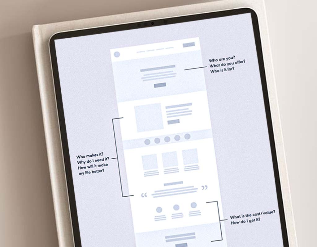
The hero section is the top portion of your homepage. It carries the most responsibility and gets the least patience.
In many service business websites, this area looks polished but says very little. The headline sounds professional but vague. The supporting text does not explain the value clearly. The next step is unclear.
If a visitor cannot answer these questions quickly, hesitation sets in:
What does this business actually do
Who is this for
What should I do next
When that clarity is missing, people do not scroll. They leave.
How to fix it
Write a direct headline that clearly states your service
Add one short line that explains the outcome or value
Use one clear call to action that matches how you work
Clarity here matters more than clever language.
Mistake 2: Too Much Text and Visual Clutter
A common issue on service business homepages is overload. Too much text. Too many sections competing for attention. Too many ideas introduced at once.
Visitors do not read homepages word for word. They scan. When everything feels equally important, nothing stands out.
This creates friction, not engagement.
What to look for
Long paragraphs stacked together
Multiple messages fighting for attention
Sections without spacing or visual separation
How to fix it
Break content into shorter, focused sections
Use simple, direct language
Let spacing and layout guide the eye
A homepage should guide visitors, not overwhelm them.
Mistake 3: Poor or Inconsistent Visuals
Visuals influence trust faster than most people realize.
Outdated photos, overly generic stock images, or mismatched visuals can quietly lower credibility. Even strong messaging struggles when visuals feel off.
Common issues
Stock photos that feel staged or impersonal
Images that do not match the tone of the brand
Inconsistent styles across the page
How to fix it
Use visuals that reflect your audience and services
Keep image quality and style consistent
Optimize images so they load quickly
Visuals should support understanding, not distract from it.
Mistake 4: No Clear Call to Action
Many homepages technically include calls to action, but they are buried, inconsistent, or competing with each other.
When visitors are given too many options, they choose none.
How to fix it
Decide on one primary next step
Repeat that same action in a few strategic places
Make the button easy to see and easy to understand
One clear action is enough.
Mistake 5: A Weak Mobile Experience
For most service businesses, mobile is the first impression.
If the mobile layout feels cramped, confusing, or hard to use, visitors leave quickly. This is often overlooked because the desktop version looks fine.
Check your site on your phone
Is the text easy to read without zooming
Are buttons easy to tap
Does the content stack in a logical order
A strong mobile experience signals professionalism and care.
Mistake 6: Slow Loading Pages
Slow load times quietly kill conversion.
Large images, unnecessary animations, and overly complex layouts can slow a homepage down. Even small delays increase drop-off.
How to fix it
Optimize image sizes
Remove unnecessary effects
Keep the homepage focused and intentional
Fast-loading pages help both visitors and search visibility.
Mistake 7: No Clear Structure or Hierarchy
When everything looks the same size or weight, visitors do not know where to focus.
Hierarchy helps people understand what matters first and what comes next.
How to fix it
Make headlines clearly distinct from body text
Use spacing to separate sections
Guide visitors from awareness to action
Structure builds confidence by making information easier to process.
What a Strong Service Business Homepage Includes
A homepage does not need to explain everything. It needs to explain the right things.
At a minimum, it should include:
A clear statement of what you do
Who you work with
A short overview of your services
One or two credibility signals
One clear call to action
That is enough for most visitors to decide whether to take the next step.
Final Thoughts
A homepage does not need to be perfect. It needs to make sense.
When the message is clear, the structure is intentional, and the experience is easy to use, people feel confident reaching out. Your website stops being something you explain away and starts supporting real business decisions.

Frequently Asked Questions:
Why is my website getting traffic but no leads?
Usually because visitors cannot quickly understand what you do, who it is for, or what to do next. When the homepage feels unclear or cluttered, people leave without taking action. This article walks through the most common reasons that happens and what to fix first.
My website looks fine. Why is it not converting?
Looking fine is not the same as creating understanding. Many service business websites look professional but fail to guide visitors. When the value is not clear upfront, people hesitate. Conversion issues are often caused by structure and messaging, not design quality.
How fast should people understand what I do on my homepage?
Ideally within a few seconds. Visitors scan before they read. If your headline and top section do not clearly explain your service and audience, they will move on. That is why the hero section is one of the most important parts of the homepage.
Do I need to redesign my entire website to fix this?
No. In many cases, improving the homepage alone makes a noticeable difference. Clarifying the message, tightening the structure, and simplifying the layout often resolves the biggest issues without a full rebuild.
What is the most important part of a service business homepage?
The hero section. It sets expectations and determines whether someone stays or leaves. If it does not clearly answer what you do, who it is for, and what to do next, the rest of the page does not matter.
How many calls to action should my homepage have?
One primary action. You can repeat it in a few places, but it should always point to the same next step. Too many options create hesitation and reduce conversion.
Does mobile optimization really matter for service businesses?
Yes. For many service businesses, mobile is the first interaction. If the site is hard to read or use on a phone, people leave quickly, even if the desktop version looks fine.
How often should I update my homepage?
At least once a year, or anytime your services, audience, or pricing change. If your business has evolved but your homepage has not, it will start working against you.
Can homepage issues affect SEO?
Yes. Clear structure, fast loading, mobile usability, and focused messaging help search engines understand your site and help visitors stay longer. Both matter.
How do I know if my homepage is costing me clients?
If people visit your site but do not reach out, book calls, or take action, your homepage may be creating confusion or hesitation. This article outlines the most common reasons and how to spot them.
Ready to Fix Your Homepage?
If your homepage feels unclear, outdated, or underperforming, it may be costing you the right clients. We help service businesses improve clarity, structure, and conversion so their website supports real growth.