Homepage Mistakes That Cost Service Businesses Their Clients
If you run a service-based business, your homepage is often the first and only chance to show that your business is clear, credible, and ready to help.
Most people decide whether they trust you within seconds. They land on your site from a search or a referral, and they are asking one question: does this business look like it can actually help me?
The problem is, many homepages are built quickly and left untouched. As your services grow and your pricing changes, the site stays the same. Instead of building trust, it raises doubt. And for service-based businesses, doubt costs you clients.
This post breaks down the most common homepage mistakes that cause confusion or hesitation. You will learn what to fix, why it matters, and how to improve your homepage with better structure, clarity, and messaging that works.
What You Will Learn
How to fix unclear homepage messaging
Why your layout or photos might be pushing people away
What kind of structure builds trust and leads to action
How to make your buttons and calls to action easier to follow
How to make your homepage support real business growth
Who This Is For
This is for business owners who offer services—like consultants, agencies, or professionals—who know their work is strong, but feel like their homepage does not show it.
You are getting good referrals. You are raising your prices. But your homepage still feels like something you put together in the early days. It does not reflect the level you are at now.
We work with business owners who use platforms like Squarespace, Wix, Showit, and Duda. The tools are fine. The problem is the structure and message.
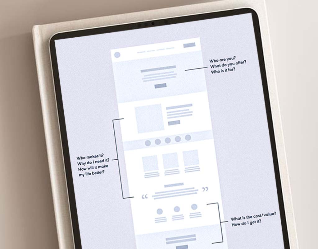
Mistake 1: Unclear Hero Section
The top part of your homepage (called the hero section) needs to answer three simple questions:
What do you do?
Who is it for?
What should someone do next?
If people cannot figure that out in five seconds, they will probably leave.
How to fix it:
Write a short headline that clearly says what you do (for example, "Bookkeeping for Consultants")
Add a short sentence that explains the value you provide
Use one clear button that tells people what to do next (like "Book a Call")
Skip vague phrases like "custom solutions" or "we help you grow." Be clear. Be specific.
Mistake 2: Poor or Off-Brand Images
The photos or images you use matter a lot. If they look outdated, fake, or random, they create confusion.
What to watch out for:
Stock photos that feel stiff or generic
Personal photos that do not match the tone of your brand
Visuals that look mismatched or low quality
How to fix it:
Use images that feel natural, reflect the kind of clients you work with, and help people picture a good result.
Mistake 3: Messy Layout or Inconsistent Design
If your homepage looks messy, people will assume your business is too.
Check for:
Fonts that look the same size and style across the page
Buttons and icons that use the same shapes and colors
Enough space between sections so the page feels easy to read
Clean design builds trust. A messy layout makes people unsure.
Mistake 4: Too Many Calls to Action
When your homepage tells people to do five different things, they get overwhelmed and do nothing.
What to fix:
Pick one clear next step (like "Book a Discovery Call")
Repeat that button or link in a few spots across the page
Use a color or style that makes the button stand out
You do not need ten options. One clear action is enough.
Mistake 5: Bad Mobile Experience
Most people will see your site on their phone first. If the mobile layout looks broken, people will leave quickly.
Check these things on your phone:
Are the buttons easy to tap?
Is the text easy to read without zooming in?
Do images and text sections stack in the right order?
A homepage that works well on mobile shows you care about your business and your clients.
Mistake 6: Not Enough Overview
You do not need to explain every detail, but you do need to show the basics.
Make sure you include:
A short intro about what you do
A quick list of services
A sentence or two about who you work with
One or two client quotes or results
One clear button for people to take action
That is all most people need to decide if they want to work with you.
Final Thoughts
Your homepage does not have to be perfect. But it does need to make sense and feel aligned with the business you run today. If the layout feels messy or your message is vague, people will move on.
We help service businesses update their homepages so they actually support sales. When your homepage is clear and easy to follow, it helps people take the next step.

Frequently Asked Questions
What should a homepage include for a service-based business?
A short headline, a short intro, a list of your core services, who you work with, one or two testimonials, and one clear button. That is enough.
How do I know if my homepage is confusing people?
If people visit your site but do not book, click, or reach out—it could be a sign that your message is not clear or the layout is too busy.
What is the best call to action for service businesses?
Use something that matches how you work. "Book a Discovery Call" or "Schedule a Consultation" are both strong if you offer 1:1 services.
Can I fix my homepage without rebuilding my whole site?
Yes. You can start with just the homepage. We help many clients do this before making bigger changes.
Does homepage layout affect SEO?
Yes. A clean, mobile-friendly layout with good structure helps search engines understand your site—and helps visitors stay longer.
How often should I update my homepage?
At least once a year. Or sooner if your services, audience, or pricing have changed.
Do I need a blog, or is a good homepage enough?
A strong homepage can still rank well on Google. A blog can help long-term, but it is not required to get started.
Ready to Stop Losing Leads at the First Click?
If your homepage feels unclear or outdated, it may be turning the right people away. We help service businesses fix what is not working—so your site builds trust and brings in better-fit leads.
Let’s Fix Your Homepage.