Brand Assets for Service Businesses: What You Actually Need and Why
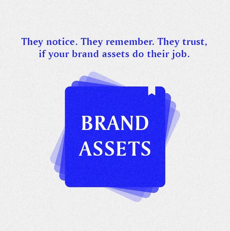
Service-based businesses that aim to earn trust and attract better clients need robust brand assets. These assets shape how your business looks, sounds, and communicates, allowing people to recognize, remember, and take you seriously.
Your brand assets create a consistent experience across every client touchpoint. Whether someone finds you through a search, reviews your proposal, or visits your website, the goal is the same: to provide clarity and credibility.
Brand assets go beyond just a logo or slogan; they encompass a comprehensive visual and verbal system that distinguishes your business from competitors. When executed effectively, they enhance your professionalism and make it easier for ideal clients to engage with you.
This guide will clarify what brand assets are, highlight the most important ones for service-based businesses, and explain how a cohesive branding system can drive genuine growth—not just improve appearances.
What Are Brand Assets?
Brand assets are the recognizable elements that embody a company's identity. They communicate who you are, what you do, and help maintain a consistent look across various platforms—such as your website, social media, proposals, and business cards.
Key brand assets include:
Business name
Logo variations
Color palette
Slogans or taglines
Typography
Design elements
Voice and tone
Mascots
Brand guidelines
Videos
Sound or music
These elements come together to create a strong brand identity. Without them, your materials may look inconsistent, and that can make your business seem unprofessional.
You don’t need every possible brand asset, just the right ones for your business model. For service providers, for example, product labels or packaging may not be necessary. Instead, focus on achieving clarity, consistency, and trust in all the areas where clients engage with you.
Is a Website a Brand Asset?
Yes, your website is definitely a part of your brand, but it shouldn't be the starting point.
Your website is where your brand identity comes to life; it’s how people interact with your business online. For it to be effective, your brand elements—logo, colors, typography, name, and messaging—must already be clearly defined.
Without a complete identity system, your website may feel disjointed. This can lead to wasted time on redesigns, repetitive content, or challenges in clearly conveying what you do.
At Boston Graphic Design Studio, we prioritize strategy. We help you define your business name and build a comprehensive brand identity system before applying that system to your website. This approach ensures your business is presented clearly and consistently across all platforms.
The Three Most Important Brand Assets
If you are building your identity from scratch or cleaning it up, focus on these first:
1. Logo Variations
A strong brand requires more than just a single logo; it needs variations tailored for different contexts.
This includes:
A horizontal version
A stacked or square version
An icon-only version
Color, black, and white versions
Files optimized for web, print, and digital use
For example, consider a company that specializes in outdoor adventure gear. Their primary logo might be horizontal, featuring the brand name alongside a graphic of a mountain. However, on social media profiles where space is limited, they might opt for a circular icon featuring just the mountain graphic. If they produce merchandise like t-shirts, they might use a vertical logo that showcases the name above the icon for better visibility.
Multiple logo variations ensure that the brand remains cohesive whether on a website, promotional materials, or social media, preventing inconsistency that could confuse potential customers.
2. Brand Colors
Color is a key element in brand recognition and plays a significant role in how customers perceive your business. Studies show that up to 90% of an initial impression depends on color alone. Choose your color palette thoughtfully, considering how different colors evoke various emotions and associations.
For instance, a wellness brand might choose calming greens and soft earth tones to promote a sense of tranquility and health. Consistently using these colors across the website, packaging, and marketing materials helps establish a strong visual identity that customers will quickly associate with your brand. If the brand were to randomly switch to bright, flashy colors in their social media posts, it could confuse customers and dilute the brand's messaging.
3. Your Tagline or One-Liner
A tagline provides clarity on what your business does and who it helps. It should be concise, straightforward, and memorable.
For example, a consulting firm specializing in small business growth might use the tagline “Empowering Your Business to Thrive.” This phrase can be included in email signatures, under the logo on business cards, and prominently displayed on the website. A clear tagline not only informs potential clients about the firm's focus but also helps create a connection by addressing their needs directly.
By prioritizing these three key brand assets—logo variations, brand colors, and a clear tagline—you establish a strong foundation for your brand. This fosters recognition and trust, making it easier for your audience to connect with your business.
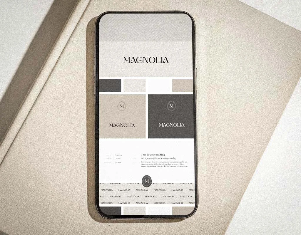
Real Example: Boston Graphic Design Studio
This identity system was built for clarity, structure, and trust. Everything was designed to support how the business actually works—not just how it looks.
The logo includes multiple variations, sized for different uses. The type and color system is clean, consistent, and chosen for visibility across screens and printed materials. The brand guide explains exactly how to apply everything without guessing.
What makes it usable is how it is delivered. All assets are stored in one organized Dropbox folder. It includes:
All logo variations in every needed format
Brand colors with web and print codes
Font files with license info
One-liner messaging
A simple usage guide
Nothing is buried in emails or saved under the wrong name. Everything is labeled, ready to use, and built to last.
This is how service businesses build trust—not by overcomplicating the brand, but by using the right tools with clarity and consistency.

Why This Matters for Service Businesses
When your branding is clear and consistent, you save time, avoid confusion, and make your business easier to trust. You stop having to redesign things from scratch. You stop second-guessing your materials. And you stop blending in with businesses that are not as serious.
If your brand feels pieced together or if you only have a logo without a solid structure, it's time for a change.
Boston Graphic Design Studio builds full brand identity systems for service-based businesses. That includes everything you need to present yourself as a professional—every time.

Frequently Asked Questions
What brand assets do I need for a service-based business?
You need a clear business name, multiple logo variations, brand color codes, font files, a one-liner (or tagline), and a brand usage guide. These create visual and verbal consistency across your website, proposals, and client materials.
Why is a logo not enough for my business?
A logo by itself will not support your business long-term. Without defined brand colors, fonts, and messaging, you will keep making design choices from scratch. That leads to inconsistency, confusion, and lost trust.
Is a website considered a brand asset?
Yes, but only when it is built on a clear brand identity. Your website applies your logo, messaging, and design system across key pages. If your brand foundation is missing, your site will feel scattered or generic.
What is included in a full brand identity system?
A complete identity system includes your name (if needed), logo variations, brand color palette, typography, one-liner, and a usage guide. Everything is delivered in a ready-to-use format so you do not have to guess.
What are logo variations and why do they matter?
Logo variations are different versions of your logo—for horizontal use, stacked layouts, icon-only spaces, and light or dark backgrounds. These make your brand flexible and professional across platforms.
Do solo service providers need full brand identity systems?
Yes. A clear identity helps solo founders look established, charge appropriately, and communicate their value quickly. It is not about size—it is about clarity and positioning.
What file types should I have for my brand assets?
You should receive logos in SVG, PNG, PDF, and JPG formats. Color codes should be included for both web (HEX) and print (CMYK). Fonts should come with clear usage rights and licensing.
How are brand assets delivered?
All assets are delivered in a single Dropbox folder—organized, labeled, and ready to use. This saves time, prevents rework, and keeps your business consistent from day one.
Conclusion: You Need the Full System, Not Just a Logo
A strong brand identity is what helps you show up clearly, build trust faster, and stay consistent without second-guessing everything.
If you are still operating with only a logo, or if your materials all look and sound different, it is time to fix that. You need a real system.
Boston Graphic Design Studio delivers full brand identity systems built for service-based businesses. That includes naming, identity, and website design, delivered in one clear process that actually fits the way you work.